Forum Redesign
25 replies · 101 views
So it seems that everyone that ever visits the site (that's not a usual) always complains that its just text and not enough graphics and it turns them off and they leave the site before ever going into the threads. I am considering doing a ground up redesign of the forum section of the site to be more visually appealing.
Do any of you know of any good looking sites that you think would translate well to a forum? Even if its a blog or cooking or fashion site we can try to see if we can implement the best ideas of all of them and put them here.
Of course I will leave a "legacy" layout for people who just like the clean look we have currently, just want to bring it up to what people expect these days with Insta and Pinterest and what not.
Any feedback would be greatly appreciated. Thanks 

I think it is more of the layout more than the content.
- Rearrange some stuff
- Get rid of the "Tags" section. It is distracting and a waste of space. Or at least make it smaller and less prominent and maybe put it somewhere on the bottom.
- Put "Recent Posts" section below the carousel across symmetrically and have the teaser text no more than a sentence long (at most 2 sentences but definitely no more)
- Reduce the number of blog posts shown on main page. Maybe between 5-8? If people want to read more could they "load more"?
- Enlarge the carousel view. I think this section should be prominent.
- Reduce the size of the IG Posts section or just get rid of it. It don't look right, not very visually appealing and kinda confusing b/c it looks like a bunch of random photos. Or have it as a little section on the right side bar but not next to carousel.
- Make social media info more prominent but use the general icons and not the "Follow on..." icon.
That's all I could think of for now  Hey, you did ask!
4 hours ago, PinkCouture said:I think it is more of the layout more than the content.
- Rearrange some stuff
- Get rid of the "Tags" section. It is distracting and a waste of space. Or at least make it smaller and less prominent and maybe put it somewhere on the bottom.
- Put "Recent Posts" section below the carousel across symmetrically and have the teaser text no more than a sentence long (at most 2 sentences but definitely no more)
- Reduce the number of blog posts shown on main page. Maybe between 5-8? If people want to read more could they "load more"?
- Enlarge the carousel view. I think this section should be prominent.
- Reduce the size of the IG Posts section or just get rid of it. It don't look right, not very visually appealing and kinda confusing b/c it looks like a bunch of random photos. Or have it as a little section on the right side bar but not next to carousel.
- Make social media info more prominent but use the general icons and not the "Follow on..." icon.
That's all I could think of for now
Thanks for the feedback, so I can make some of those changes. But I was referring to the forum itself
https://www.bellazon.com/main/index.php
But back to your suggestions,
- Reduce the size of the IG Posts section or just get rid of it. It don't look right, not very visually appealing and kinda confusing b/c it looks like a bunch of random photos. Or have it as a little section on the right side bar but not next to carousel.
The IG is at the very very bottom of the Blog on my computer. Where do you see the IG next to the carousel? Or on what device?
Also the Social Media icons are pretty prominent I thought.
Or are you referring to some other icons?
Let me know if we are talking about different things, thanks.
- At this moment, there are 560 guests (writing off the members who just didn't feel like logging in) vs 200 members. In the individual subforums, it only lists the number of members and not the number of guests anymore, but I'm assuming the bulk are looking at Fashion Models. Either way, the ability to see what the guests are looking at again may help.
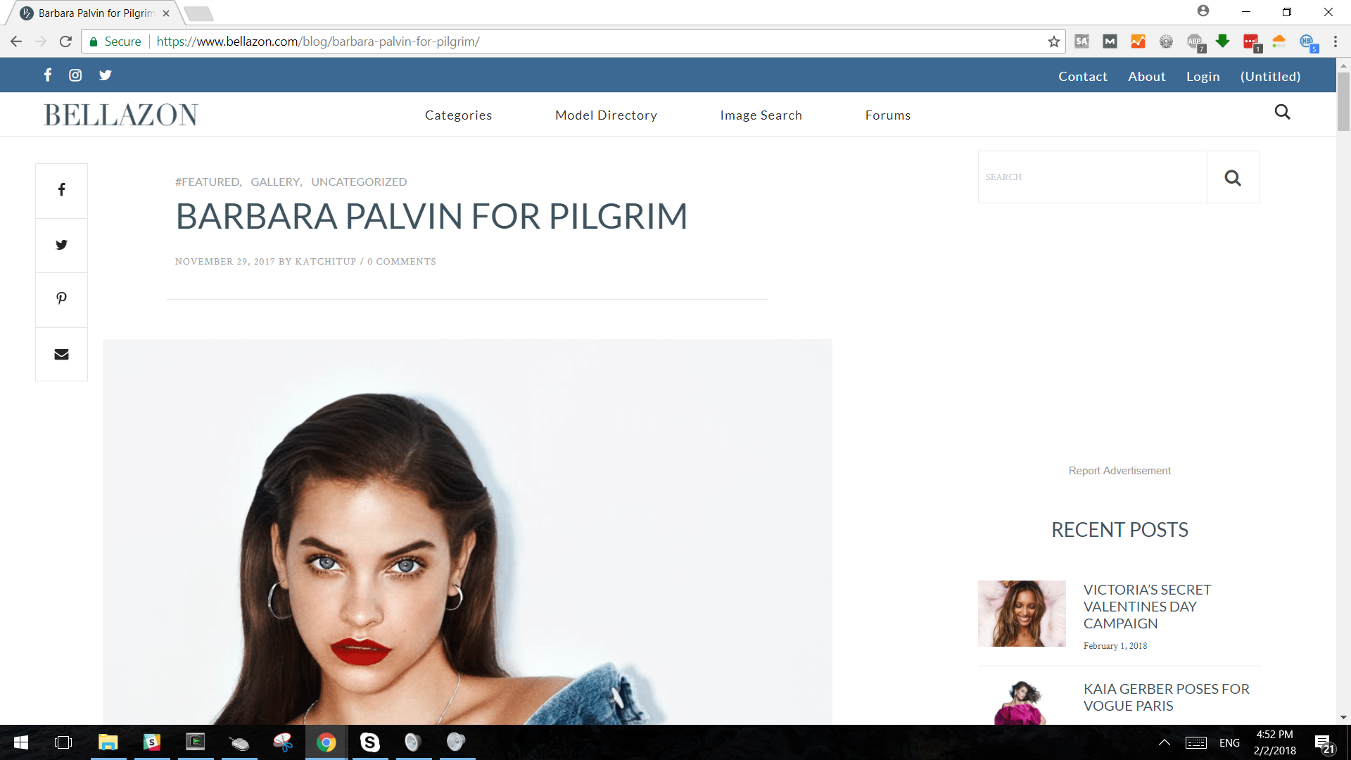
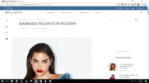
- Fashionmodeldirectory.com looks good. The coloration is not what some would call as gender neutral so to speak...  by post WWII western standards anyway, but the format catches the eye and is fairly practical.
- Also, it may not change the design as much, but it seems to me that recent posts on the forum relating more to Fashion Models than the blog may serve more for getting them to go into the threads. Also, the ability to search a specific member's topics is pretty useful too.
On 2/2/2018 at 7:53 PM, maddog107 said:
Thanks for the feedback, so I can make some of those changes. But I was referring to the forum itself
https://www.bellazon.com/main/index.php
But back to your suggestions,
- Reduce the size of the IG Posts section or just get rid of it. It don't look right, not very visually appealing and kinda confusing b/c it looks like a bunch of random photos. Or have it as a little section on the right side bar but not next to carousel.
The IG is at the very very bottom of the Blog on my computer. Where do you see the IG next to the carousel? Or on what device?
Also the Social Media icons are pretty prominent I thought.
Or are you referring to some other icons?
Let me know if we are talking about different things, thanks.
I meant have the IG posts where "Recent Posts" is currently located and also have the carousel go across the page. I will try to draw pictures if it is still unclear  TBH, I don't think having IG posts on the main page is necessary b/c all the content is on this site and not on IG. It is kinda strange to direct people to our IG page only to direct them back here
As for the forum I don't have any major issues with how it looks. I think it looks likes a typical forums  However if you are getting enough feedback maybe an update is necessary. I guess the descriptions to each section could be shorter. That's all I could think of for now
13 hours ago, Joe > Average said:- At this moment, there are 560 guests (writing off the members who just didn't feel like logging in) vs 200 members. In the individual subforums, it only lists the number of members and not the number of guests anymore, but I'm assuming the bulk are looking at Fashion Models. Either way, the ability to see what the guests are looking at again may help.
You could still do that
Ok only 2 years later I am finally getting around to this
So I took the week off from work and I am working on this. Having to learn Adobe XD but here is what I have so far. Right now I am working on mobile only, any input would be greatly appreciated before I go to deep. I will try to keep the link updated as I go along and there is still a lot of animations to make work but we will get there. Also there are a lot of pages left to do so any ideas welcome. Thanks!
https://xd.adobe.com/view/4679f6c9-9d36-4390-4dc5-4d435d1b1f55-3048/grid

Looks good. 

Looking so so good Bossman!

I like it, it looks great!
I really like it!
Plz any feedback/suggestions are appreciated.
I have created a thread page. Still not super happy with how to show a division between one post and the other but we will figure something out.
Also I put examples of a quoted post, Instagram and Youtube to show how it would be presented. They will be constrained to the container size and if there are multiple we will try to place them in a carousel so it doesn't go on forever. Instagram we will remove all the post, so just the image remains and you can click it to display the full thing if you wish.
Let me know your thoughts.
I really like the idea of not having it exceed the normal image box. And having all the ig info not automatically display as it takes longer to load on mobile when it does that and looks quite cluttered.
I’m not 100% sold on the carousal idea though as quite frequently I find it loads very slowly. Maybe there’s a way to fix the load time.
27 minutes ago, phenobarbie said:I really like the idea of not having it exceed the normal image box. And having all the ig info not automatically display as it takes longer to load on mobile when it does that and looks quite cluttered.
I’m not 100% sold on the carousal idea though as quite frequently I find it loads very slowly. Maybe there’s a way to fix the load time.
Thanks for the feedback. So regarding performance we will try to use the latest and greatest technology (React Native used by Facebook/Insta/ebay/etc or Flutter used by google) which create "native" apps in a browser so in theory the performance should be pretty good.
I agree right now on our current website its pretty slow. I too am concerned about the carousel but more so because people like to post 50+ images in one go which could be annoying to scroll though sideways, but probably still better then having to scroll down a giant page like we do currently, especially if you have no interest in those pictures. Perhaps we will only show a few in the carousel and then a "See more" button that could pop up a gallery view or something to quickly scroll through a lot of pictures.
Also added a search page:
I love the current one.  So I'll have to think about it.
On 4/9/2020 at 4:00 AM, maddog107 said:
Thanks for the feedback. So regarding performance we will try to use the latest and greatest technology (React Native used by Facebook/Insta/ebay/etc or Flutter used by google) which create "native" apps in a browser so in theory the performance should be pretty good.
I agree right now on our current website its pretty slow. I too am concerned about the carousel but more so because people like to post 50+ images in one go which could be annoying to scroll though sideways, but probably still better then having to scroll down a giant page like we do currently, especially if you have no interest in those pictures. Perhaps we will only show a few in the carousel and then a "See more" button that could pop up a gallery view or something to quickly scroll through a lot of pictures.
Also added a search page:
This is what I would do. I think the vast majority of people would rather decide if they want to see the whole set instead of being sort of forced to wait for the whole thing to load. Especially in those sets that are 50+ or 100+ pictures from the same event/paparazzi.
But I love how it all looks so far.
Can you all plz vote/feedback.
Category Grid View:
Option 1:
Option 2:
Category List View:
Option 1:
Option 2:
Thoughts on these 2? As you all mentioned I am trying to remove all the fluff that is currently on BZ.
2nd option has smaller "react" section, images are square instead of round and user information/post information is smaller as well.
And I have been told I should make all images squareish as rounded is "old school". Thoughts?
I like both, but ..
Category Grid View: 2
Category List View: 2
I like how clean it looks, but it has a little extra something that makes it special looking
1 hour ago, maddog107 said:Thoughts on these 2? As you all mentioned I am trying to remove all the fluff that is currently on BZ.
2nd option has smaller "react" section, images are square instead of round and user information/post information is smaller as well.
And I have been told I should make all images squareish as rounded is "old school". Thoughts?
I think I like the second one out of the two. I line separating the replies looks nice, (View Option 2), and I like squareish over rounded.