General Discussion
2339 replies · 17314 views
8 minutes ago, katchitup said:.. but I really like the idea behind Maioriz with the faded image of a model in the background. That would look nice as a Banner or something...
If the banner keeps on changing, Maioriz doesn't provide a lot of creative free b/c it would only work for certain types of banners  I am also not a fan of the font. Looks unpolished but not in a good or sophisticated way.
Just now, PinkCouture said:
If the banner keeps on changing, Maioriz doesn't provide a lot of creative free b/c it would only work for certain types of banners
Thats the thing I like the idea of it and it looks cool but I realize it doesn't really transition across different things very well
--------
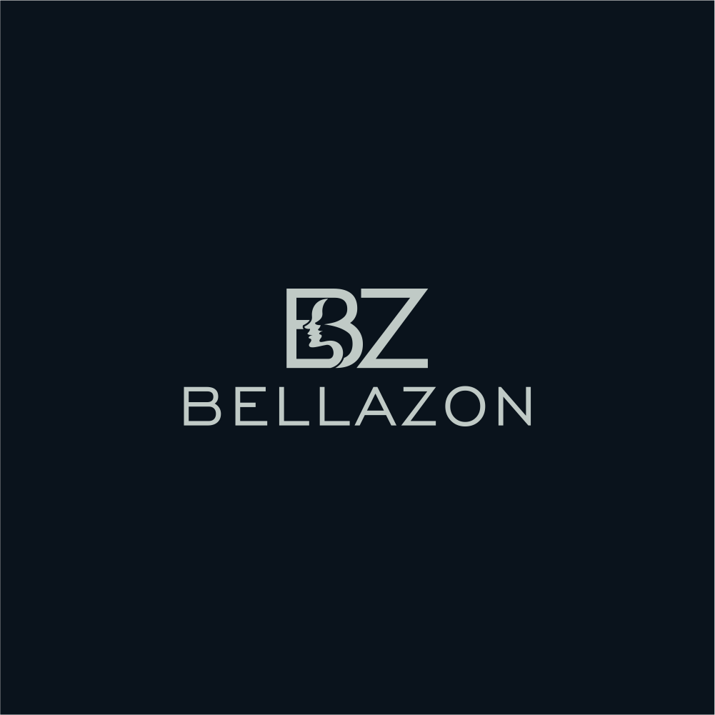
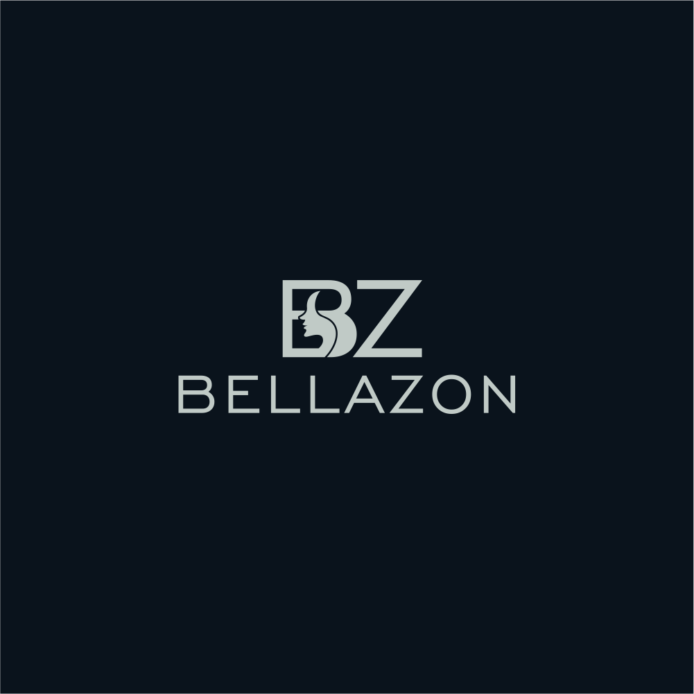
Once again out of the 6 finalists my vote is for Redsoul!
1 hour ago, Prettyphile said:Can you please post who we're voting on again?
+1 
Who are the other 2 besides Redsoul, plus44, MARAT KAA and Thulla? 

On 3/15/2016 at 10:50 AM, maddog107 said:upinipin
Rapalo
Arvinza
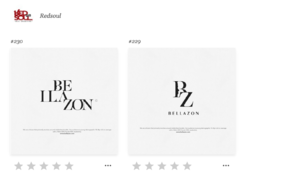
Redsoul
-iTaChi-
+ Thulla
1 hour ago, katchitup said:Thats the thing
--------
Once again out of the 6 finalists my vote is for Redsoul!
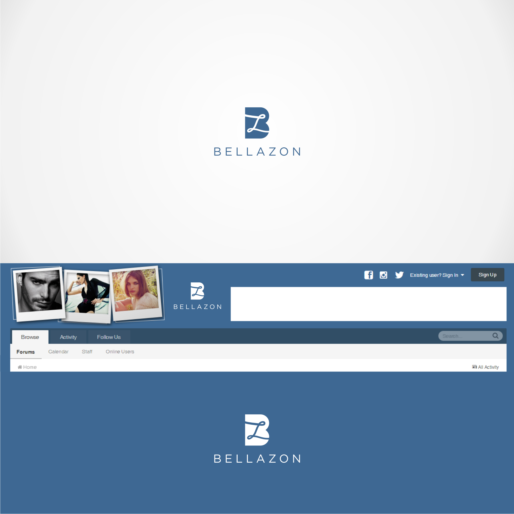
Any changed to the Redsoul logo you would like to see? Maybe a less prominent(or none) face on the B or something? Please try to be as specific as possible so I can pass it on. Color changes, move letters around, do a two tone, etc. Thanks.
1 hour ago, PinkCouture said:
If the banner keeps on changing, Maioriz doesn't provide a lot of creative free b/c it would only work for certain types of banners
That person did not make the cut but I can ask one of the other people to superimpose their logo over it to see how it looks. Also I am not worried about different logos for different medium as long as the logo (text) itself is consistent across all platforms.
So on a desktop if we put the text ontop of a faded image for our banner, but on mobile its just the text I think that is ok.
I'm not sure, maybe some samples with the colors played up with the blue color of our site, etc. I'm just curious what are these going to be used for exactly? On our site, social media or?
14 minutes ago, katchitup said:I'm not sure, maybe some samples with the colors played up with the blue color of our site, etc. I'm just curious what are these going to be used for exactly? On our site, social media or?
Everywhere, this will replace the current logo we have.
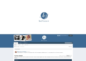
^And our current logo is this, not the entire picture with the banner correct?

55 minutes ago, katchitup said:^And our current logo is this, not the entire picture with the banner correct?

With all we should have multiple versions:
- Color (Blue)
- Black
- White with a black outline or stroke
- With and without the accompanied "Bellazon" text (if applicable)
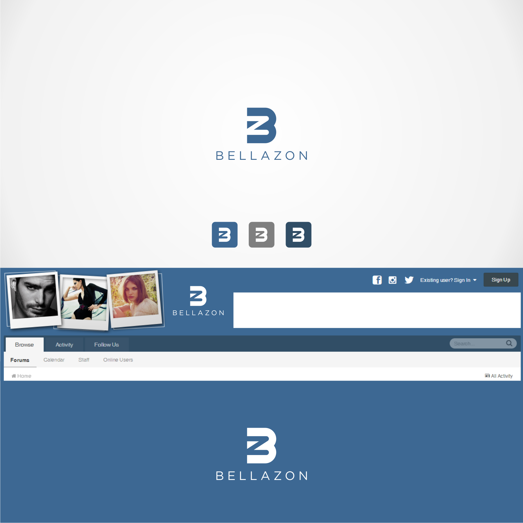
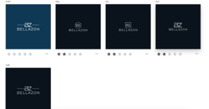
upinipin: #54 would work the best across all usage and I also like it the most out of the 5 samples.
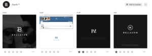
Rapalo: I like #148 and #150 the most but would be ok with #92.
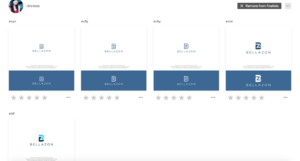
Arvinza: I like #68 and #106 but would be ok with #185.
Redsoul: #229 would work the best across all usage.
-iTaChi-: On the fence about this designer. Definitely not #194---logo not distinguishable and quite sub-par.
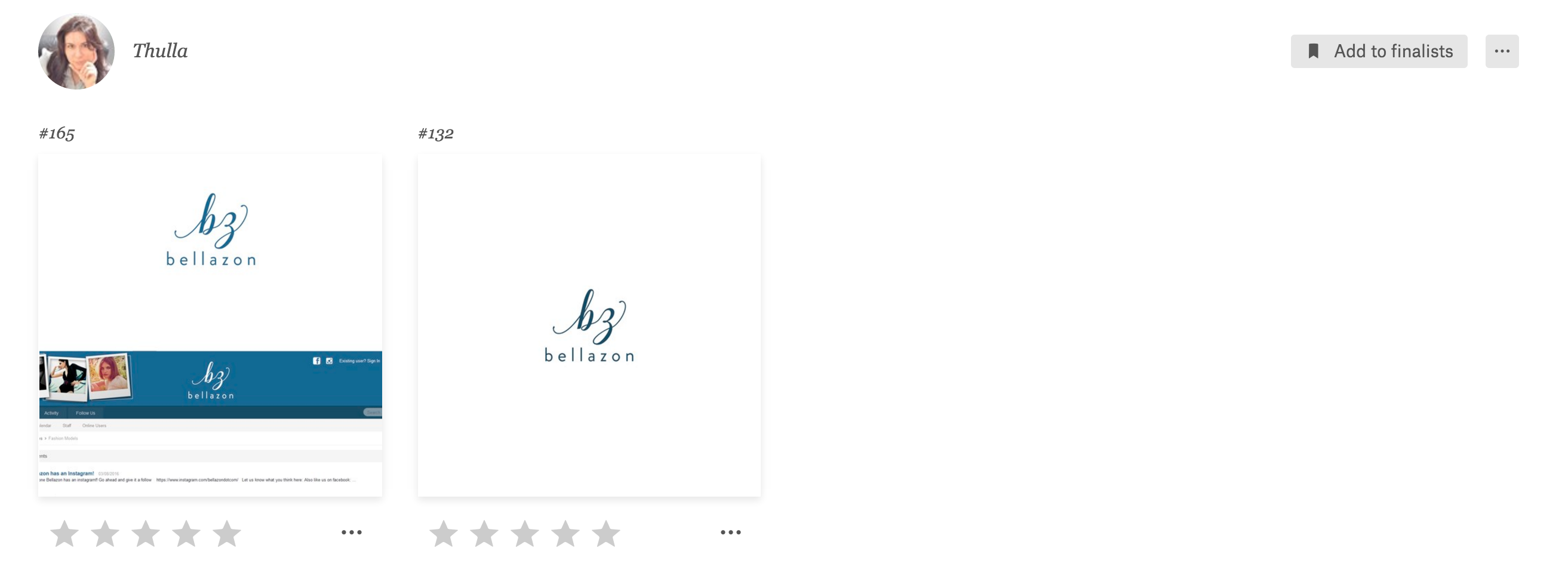
Thulla: Would work best if there was a shape surrounding "bz". Perhaps a circle or a square---I like a circle better. Or at least have the text "bz" outlined/stroked so it stands out more and doesn't get lost when applied onto certain images.
The Redsoul is my favorite of the remaining ones. I'm partial to the blue and white coloring, but do like the idea of multiple versions too.
upinipin: #46 ( not a fan)
Rapalo: #150 ( not a fan)
Arvinza: #68 ( not a fan)
Redsoul: #229 (Fav)
-iTaChi-: #194 (Close Second!)
Thulla: #132 ( not a fan)
45 minutes ago, Joe > Average said:...but do like the idea of multiple versions too.
It is to cover our bases so the logo would show up on backgrounds of different colors, shades and tones 
I think Redsouls design is the most stylish.
It is perhaps a tiny bit formal considering our "brand", though.
Thulla designs:
Some alternate upinpin designs.
Also I let all of them know that we wanted different colors to see how it looks.
51 minutes ago, maddog107 said:
This one looks better than I'd imagined when it forms part of the homepage.
@maddog107 Is there any chance we could see a version of the Arvinza design with a looser, freer-looking 'Z' inside the main graphic?
I like the updated Thulla designs 
I prefer what upinpin designed originally
Arvinza "more free" Z @Michael* , I asked for a different cursive Z as not a huge fan of this but you think this is the right idea?