General Discussion
2339 replies · 17317 views
Just now, PinkCouture said:
Say go for it!
We all get to review it before it becomes official right?

Yes of course, my understanding is a bunch of people will submit logos and then we (ill share a screenshot or something) get to chose the ones we like and filter it down and ask for any changes.
^ Sounds like a plan!
56 minutes ago, PinkCouture said:^ Sounds like a plan!
Pinky et. all, anyone have any logos they like that we can give to the designers to see if they get inspired by them?
We already got one submission, wow that was fast.
Anyways I will post the credentials here so you guys can log in and take a look, we have like 4 days or something to get the first round of submissions and I need to provide feedback for all of them.
I asked for them to create a small BZ logo to go along with the "bellazon" so we can use it in different scenarios. Ill keep you guys posted as they come in.
Feel free to comment and recommend changes to this first entry.
#1
#2
@katchitup @PinkCouture I added the FB and IG image at the very top, any suggestion as to the color? White kind of blends in with the others but like a red doesnt really match.
Also we have a twitter handle yet?
18 minutes ago, maddog107 said:@katchitup @PinkCouture I added the FB and IG image at the very top, any suggestion as to the color? White kind of blends in with the others but like a red doesnt really match.
Also we have a twitter handle yet?
I like the white. Another option is to have the IG logo to be in color 
I don't think we have a twitter yet.
@katchitup Could you please post the IG login? That way if you are away or not available one of us could be your backup 
@PinkCouture @katchitup and all others.
Do we want to integrate some sort of "slogan" to our logo?
Fashion. Celebrities. and more.
Thats the only thing I can come up with but im not good at these things. Any thoughts?
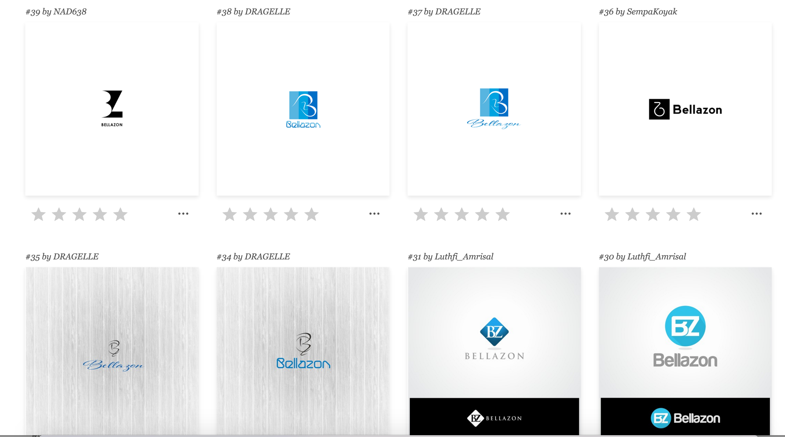
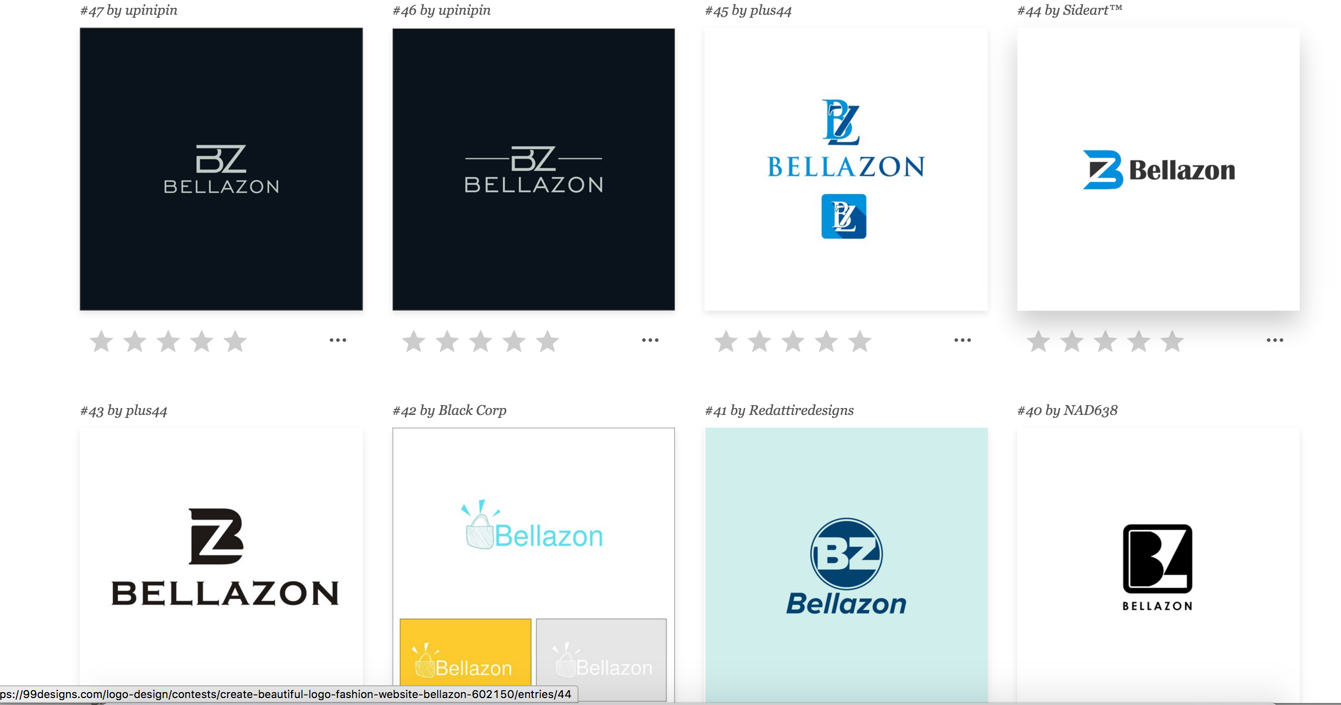
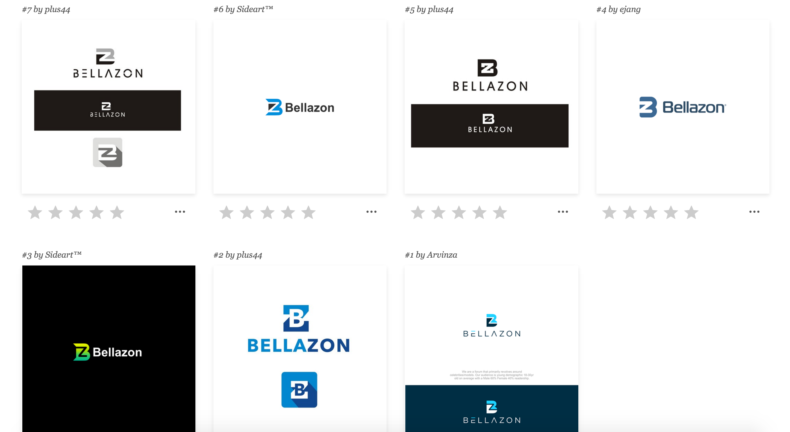
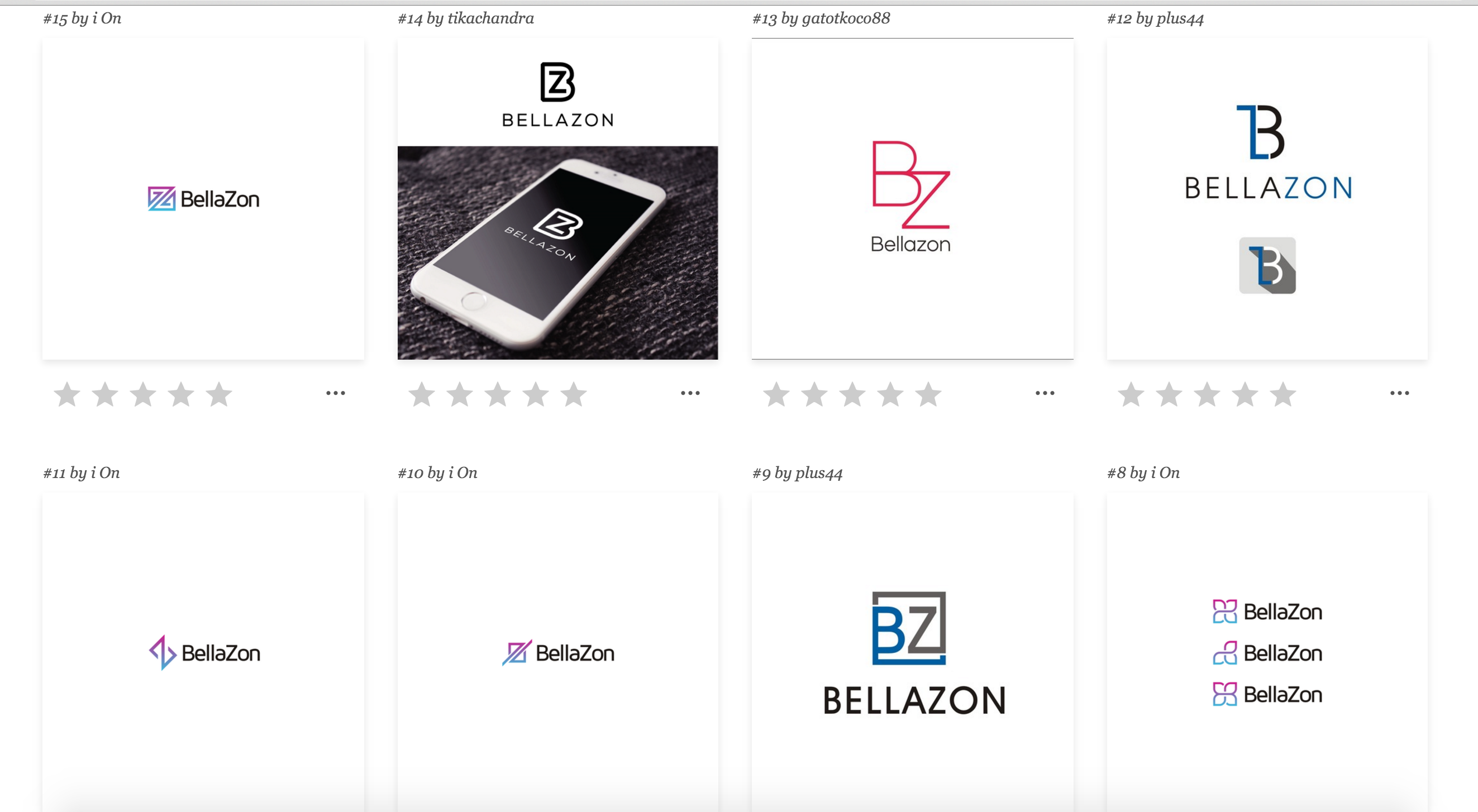
Here are some logos submitted so far.
1 hour ago, maddog107 said:We already got one submission, wow that was fast.
Anyways I will post the credentials here so you guys can log in and take a look, we have like 4 days or something to get the first round of submissions and I need to provide feedback for all of them.
I asked for them to create a small BZ logo to go along with the "bellazon" so we can use it in different scenarios. Ill keep you guys posted as they come in.
Feel free to comment and recommend changes to this first entry.
...
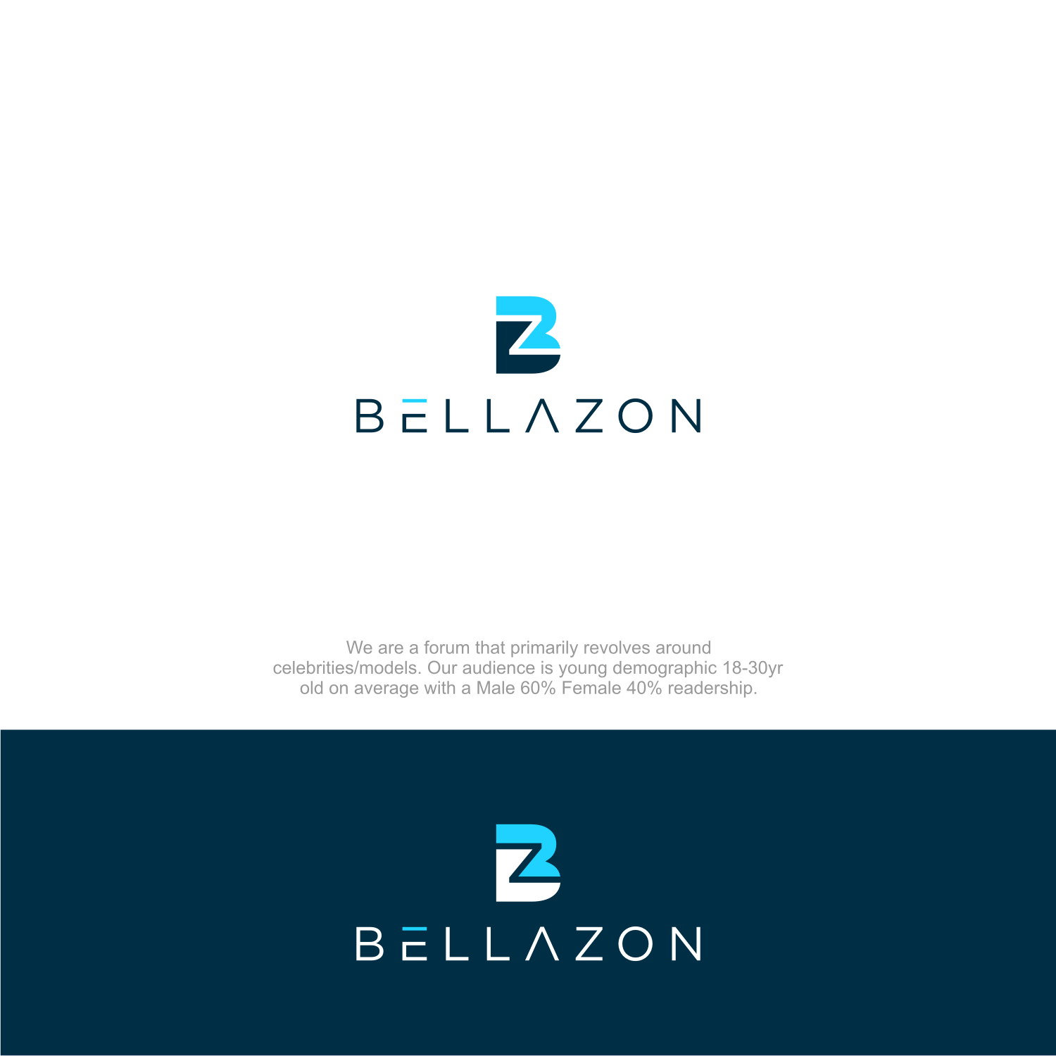
Logo #1
This is a good start and this designer seem to be on the right track. The fact he/she thought about light and dark backgrounds is a sign of potential. I like the idea of incorporating the "B" and the "Z" as one and the font choice is good. Although I do think the font could be tweaked. Not sure how I feel about the "E" and "A"---I don't think they necessarily needed to be modified by the designer. Could he/she show the original font before it was modified? I think there is opportunities for this logo to be better (more on that later). We will keep this logo option in mind.
Logo #2
I am meh about this logo. The logo looks more like something for a tech startup than an establish fashion model and celeb forum. The logo on top looks simple but not in a good way. I am all about simplicity but not when it looks trite and lacking sincere thought. However the font is good and I really like the how "Bella" and "zon" are different colors.
When looking at the logo options it is important to consider how well each would look on a light and dark background. It also important to think about how well each would translate to black & white, grayscale and reverse white.
The parameters given to the design was a goods start but it is too vague. It is great we told them what type of forum we are and our demographic but what does it all mean? Those things are subjective and could be interpreted in various ways. In order for the designers to create something that represents and capture BZ we need to be specific. Adjectives and adverbs would greatly help the designers to achieve the ideal logo.
1 minute ago, PinkCouture said:
Logo #1
This is a good start and this designer seem to be on the right track. The fact he/she thought about light and dark backgrounds is a sign of potential. I like the idea of incorporating the "B" and the "Z" as one and the font choice is good. Although I do think the font could be tweaked. Not sure how I feel about the "E" and "A"---I don't think they necessarily needed to be modified by the designer. Could he/she show the original font before it was modified? I think there is opportunities for this logo to be better (more on that later). We will keep this logo option in mind.
Logo #2
I am meh about this logo. The logo looks more like something for a tech startup than an establish fashion model and celeb forum. The logo on top looks simple but not in a good way. I am all about simplicity but not when it looks trite and lacking sincere thought. However the font is good and I really like the how "Bella" and "zon" are different colors.
When looking at the logo options it is important to consider how well each would look on a light and dark background. It also important to think about how well each would translate to black & white, grayscale and reverse white.
The parameters given to the design was a goods start but it is too vague. It is great we told them what type of forum we are and our demographic but what does it all mean? Those things are subjective and could be interpreted in various ways. In order for the designers to create something that represents and capture BZ we need to be specific. Adjectives and adverbs would greatly help the designers to achieve the ideal logo.
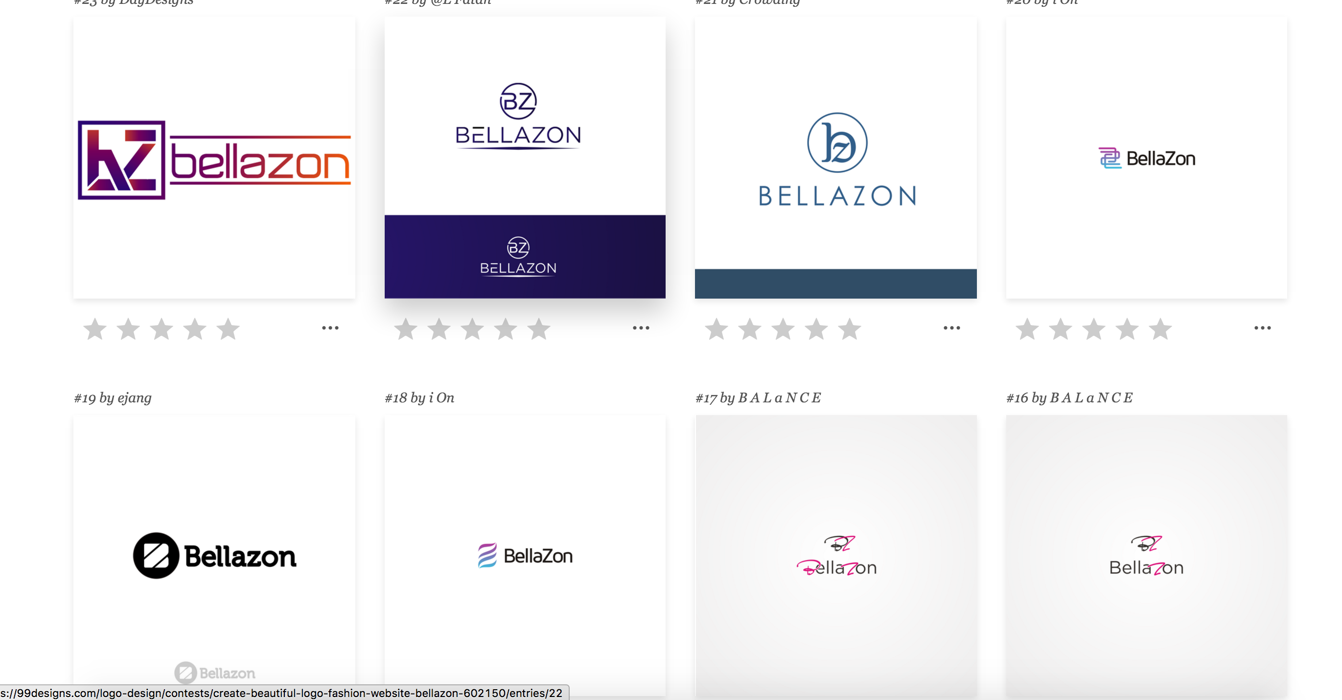
Sure if you coudl write a the adjectives and adverbs you think appropraitly describe us that would be great. Ill send this feedback to the guys, also in the previous post I posted 23 other logos that have been submitted thus far.
let me know if you belive i should remove the requirement of BZ if that gives them more creative freedom or is too limiting. Shoudl we just stick to pure text or do we need to incorporate like a outline of a girl or something that is relevant to modeling?
^What are those logo's for, the main page, app??? I'm a bit confused 
2 minutes ago, katchitup said:^What are those logo's for, the main page, app??? I'm a bit confused
An official logo for general use
6 minutes ago, katchitup said:^What are those logo's for, the main page, app??? I'm a bit confused
Just trying to be legit company now. Official logo to use on our social accounts, banners, mobile, etc.
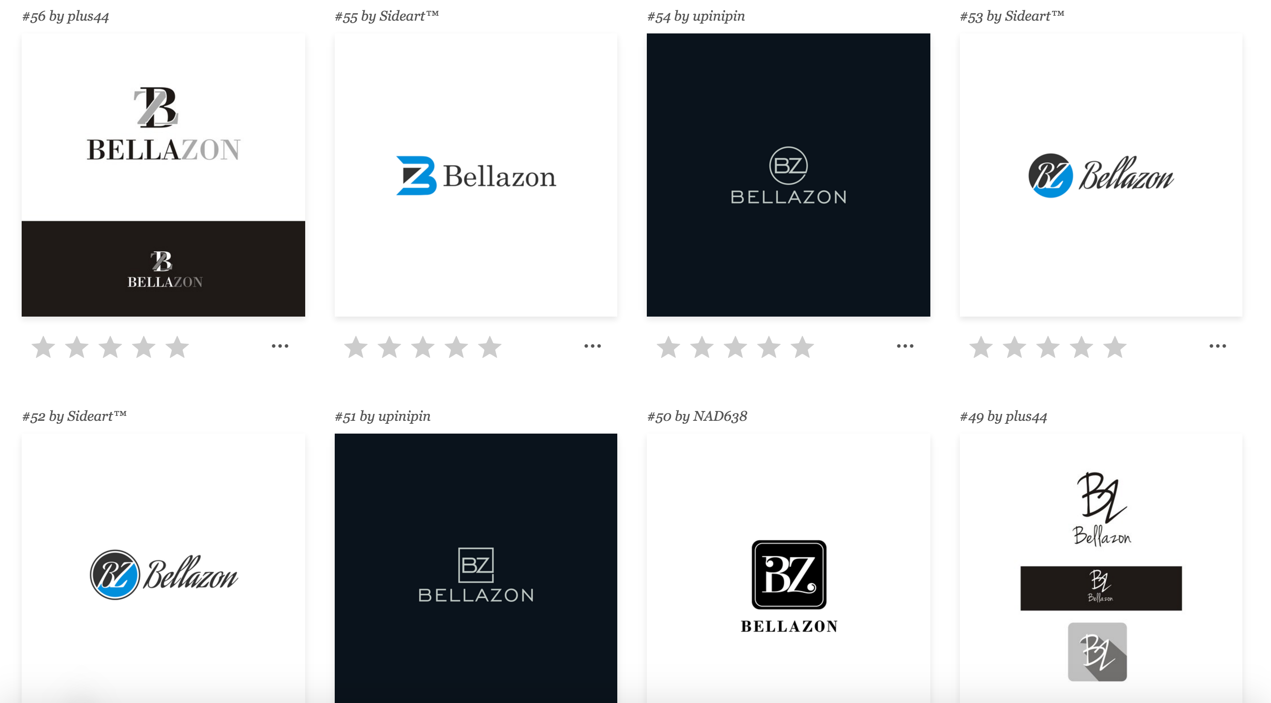
Ahhh I see. Not going to lie the Instagram looks pretty cool with the photo it has now because the color matchs the link color of instagram  But for the logos I kind of like #21. #17 and #16 I like too but maybe the pic letters could be changed to blue to match our site color? If not we could change the site color too to go along with the logo color.
9 minutes ago, maddog107 said:
Sure if you coudl write a the adjectives and adverbs you think appropraitly describe us that would be great. Ill send this feedback to the guys, also in the previous post I posted 23 other logos that have been submitted thus far.
let me know if you belive i should remove the requirement of BZ if that gives them more creative freedom or is too limiting. Shoudl we just stick to pure text or do we need to incorporate like a outline of a girl or something that is relevant to modeling?
Sure I will think of some but could I let you know maybe tomorrow? My head hurts and not functioning at full potential now 
I think some creative freedom is good. It is important to give parameters but being too strict doesn't benefit anyone. I think suggestion of style, tone and ideal colors are enough for them to work with.
The thing with incorporating a female could become dated and cheapen the impression of the site. However if a designer could figure out a way to make it look timeless and with some level of sophistication then I am all for it!
At quick glance at the new logo options so far I like 13, 21 (if it's san-serif) and 22. Those are simple but chic and would translate well on different media.
9 minutes ago, PinkCouture said:
Sure I will think of some but could I let you know maybe tomorrow? My head hurts and not functioning at full potential now
I think some creative freedom is good. It is important to give parameters but being too strict doesn't benefit anyone. I think suggestion of style, tone and ideal colors are enough for them to work with.
The thing with incorporating a female could become dated and cheapen the impression of the site. However if a designer could figure out a way to make it look timeless and with some level of sophistication then I am all for it!
At quick glance at the new logo options so far I like 13, 21 (if it's san-serif) and 22. Those are simple but chic and would translate well on different media.
Sure whenever you have a chance, the sooner the better though as these guys only have < 4 days to finish before I need to chose some finalists for the 2nd round.
@katchitup Regarding your color question, yes all these guys ask for feedback and we tell them whatever we want. Change color, change size, remove something and they will do it. We have as many revisions as we want.
4 minutes ago, katchitup said:I like too but maybe the pic letters could be changed to blue to match our site color? If not we could change the site color too to go along with the logo color.
I think most people associate BZ with blueish tones. It has become part of our "brand" and we need to be thoughtful when considering this change. Something as simple as changing the colors could create dissonance and incongruity. Ex. The Gap and Pepsi.
Just now, maddog107 said:
@katchitup Regarding your color question, yes all these guys ask for feedback and we tell them whatever we want. Change color, change size, remove something and they will do it. We have as many revisions as we want.
OK! I really like the pink color on #16/17 actually but it obviously doesn't go with the other colors on our site so one of our shades of blue would look good  #16/ #17 the best with the pink changed to blue, then it's #21 for me
6 minutes ago, PinkCouture said:
I think most people associate BZ with blueish tones. It has become part of our "brand" and we need to be thoughtful when considering this change. Something as simple as changing the colors could create dissonance and incongruity. Ex. The Gap and Pepsi.
Agreed. I really like the idea of pink/purple but that is more associated with TFS 
More sets of designs.