General Discussion
2339 replies · 17318 views
@katchitup @PinkCouture @Michael*
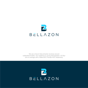
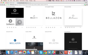
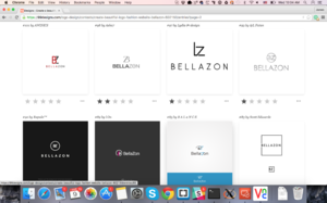
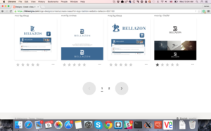
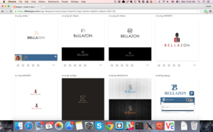
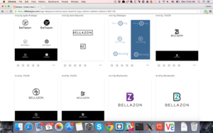
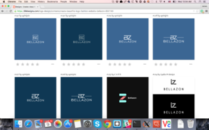
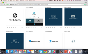
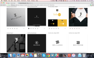
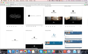
Here are the latest ones, so many to chose from!
So Katchitup, the modified the colors to be blueish instead of pink on the ones you liked
Pinky, they modified the text so the B and A are normal now.
Please let me know what feedback you want to provide, we have 3 more days to make more revisions.
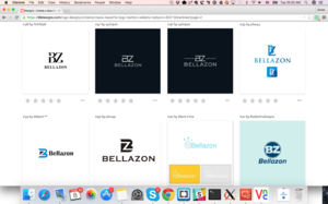
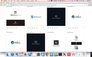
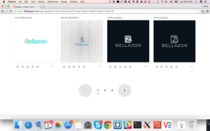
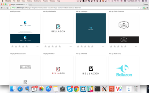

@maddogOh my so many good ones! Here are the ones I like the best: 45 (like the concept of the one on top but on the fence about the tone of the colors), 46, 47, 48 (on the fence about the font but like the overall concept), 51, 54, 56 (could we also have a blue version of this one?), 89 (could we get a version with blue hair?) 93, 95, 98.
Another idea I have is if the "B" and "Z" could somehow form a shape or a silhouette of a woman.

When I look at the thumbnails as they appear in the above post, 87 is the one that really stands out visually. I like the fact that it's bold and symmetrical (which would be quite handy for all our different mediums and applications), but has a certain a sense of fun and freedom at the same time. ![]()

I really like the concept of #77, with the faded image of a woman in the background. I really like that one.
Or the #49 really liking all those different ones in that box. Maybe not black and white, but liking the text design.
And still really like #84 ![]()

We will need a color, B&W and RW version regardless. Keep in mind the logo must distinguishable in enough even at 16px x 16px ![]()

49 minutes ago, PinkCouture said:We will need a color, B&W and RW version regardless. Keep in mind the logo must distinguishable in enough even at 16px x 16px
I communicated that request yesterday as well as requested silhouettes of faces/women in the logo if possible.

Ok here are 2 more, I think we really need to start reducing it down to the few that we really like that we think we can modify to really fit the identity of the site. Also a couple of the designers said the site colors were pretty bland :| They want us to design the website around the logo. I dont mind considering I really like some of these logos but thats a huge undertaking.
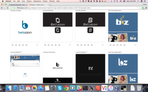

Personally I am liking:
#148
#92
#138 if they change the font of the Z which I feel a bit off for whatever reason.
#102
#98 (but usually these really thin fonts dont look great on the website)
#106
#47
The paradox of choice I suppose, so many good options. @PinkCouture @Michael* @katchitup Thoughts on the newer ones?

2 hours ago, maddog107 said:Ok here are 2 more, I think we really need to start reducing it down to the few that we really like that we think we can modify to really fit the identity of the site. Also a couple of the designers said the site colors were pretty bland :| They want us to design the website around the logo. I dont mind considering I really like some of these logos but thats a huge undertaking.
When is the cut-off date for the designers to submit their designs? I think once we know the cut-off date it would be easier decide. Considering there has been so many design edits & etc. we should review all the options a final time and select the ones we like the best. For the ones all of us, or at least most of us, like we could compile them for a vote.
The site colors change with skins so "problem solved." It is too common for designers to interject their opinions when it isn't their place to do so. It is often hard for them to make a sincere effort to get to know their client's brand and see beyond design aspects. It is an assumption that great designs = great success. Not always true. Just look at some of the past CLIO winners. Yes, their designs were superb but did their clients' ROI always correlate? No. I think it is ok if we maybe played around with different tones of blue, and perhaps mindfully with a few other colors but the primary has to be blue especially the logo. The color blue is synonymous BZ. It is part of our core and identity. Brands that stray from their core and identity usually don't end up doing too well.
Of the new batch of logos you posted I like these the most: 92, 98, 105, 106, 107, 117 (in blue maybe?), 143, 148.

4 minutes ago, PinkCouture said:
When is the cut-off date for the designers to submit their designs? I think once we know the cut-off date it would be easier decide. Considering there has been so many design edits & etc. we should review all the options a final time and select the ones we like the best. For the ones all of us, or at least most of us, like we could compile them for a vote.
The site colors change with skins so "problem solved." It is too common for designers to interject their opinions when it isn't their place to do so. It is often hard for them to make a sincere effort to get to know their client's brand and see beyond design aspects. It is an assumption that great designs = great success. Not always true. Just look at some of the past CLIO winners. Yes, their designs were superb but did their clients' ROI always correlate? No. I think it is ok if we maybe played around with different tones of blue, and perhaps mindfully with a few other colors but the primary has to be blue especially the logo. The color blue is synonymous BZ. It is part of our core and identity. Brands that stray from their core and identity usually don't end up doing too well.
Of the new batch of logos you posted I like these the most: 92, 98, 105, 106, 107, 117 (in blue maybe?), 143, 148.
Ok sounds like a plan, cut off is:
Rate, eliminate, and comment on designs. Designers have 1 day, 20 hours left to submit design concepts.
So we will wait until then and I will post all the ones that I have yet to eliminate because they were pretty terrible ![]()
After that you do:
Select finalists
Duration: 4 days
Pick up to six designers to continue working with in the Final Round. Once you select finalists your prize is guaranteed and you're onto the final stretch.
But feedback on the current designs is still needed as we can guide them towards something we like.

23 hours ago, PinkCouture said:We will need a color, B&W and RW version regardless. Keep in mind the logo must distinguishable in enough even at 16px x 16px
Very true very true.
And I agree on the site colors. The blue has been with us for a long time and it's just part of the brand image of the site. Pinks/purples are more associated with TFS and really any other colors (like green or orange) just look bad ![]() So the blue's and greys are just us
So the blue's and greys are just us ![]()
#106 is probably the most distinguishable and can run smoothly across every medium but kind of boring. Maybe like the other designs there could be a cursive "z" or little twist to it. Change the BZ symbol to something a little less blocky and slightly more dainty.
I still like #84 but like Pink said not sure how well/distinguishable that would look when it's much smaller. I also really like #77 with the faded image of a model in the background. Regardless of the text/design I think that would be pretty cool for Facebook. Maybe the BZ not in black but our blue site colors.

27 minutes ago, katchitup said:#106 is probably the most distinguishable and can run smoothly across every medium but kind of boring. Maybe like the other designs there could be a cursive "z" or little twist to it. Change the BZ symbol to something a little less blocky and slightly more dainty.
That's a good point. If it was do-able, I'd love to see a version of 106 with a looser, freer 'Z' inside the main graphic. ![]()

13 hours ago, maddog107 said:
But feedback on the current designs is still needed as we can guide them towards something we like.
I think the submissions so far are great and I definitely think our official logo is somewhere in the bunch ![]() The only suggestion I could think right now is for the non-blue ones could they also do a blue one so we know what it looks like in color?
The only suggestion I could think right now is for the non-blue ones could they also do a blue one so we know what it looks like in color? ![]()

Now that I got most of your attention, could I have your feedback on the following? LD just asked me for an update. If I remember correctly both LD and PB were suspected of multiple accounts but I think that has been resolved. Also, if we give one a thread you know the other will get one as well ![]()
Thanks! ![]()
On 3/3/2016 at 3:03 PM, PinkCouture said:lostdiadem would like to start a personal thread for peroxideblonde. Here's the personal thread guidelines:
<___base_url___>/topic/26656-general-discussion/?do=embed&embedComment=2796627&embedDo=findComment
Thoughts on granting peroxideblonde a thread?


^ Ones I like and I think would work: 162, 163, 165, 166, 167, 172
I also like it when "Bella" and "zon" are 2 different colors/tones ![]()

Elsa Hosk fan posted this on our Insta, kind of nice ![]()
-
Quote
yay_elsaI'm happy to follow the great Bellazon, your site is the best and inspires me. Good luck with your insta! ??
